How Koala adopts simplicity in their UX and product design


- Koala on why simplicity is key when designing UX
- 1. Too much information might be hindering conversion
- 2. Test your assumptions
- 3. You can’t learn if you don’t fail
- 3 user experience tips from Scott on designing for simplicity in a chaotic digital world
- If you couldn’t attend CX Circle Sydney, don’t worry because we’ve got you covered. You can catch all sessions on demand here.
Koala on why simplicity is key when designing UX
To design user experiences that actually convert in the age of distraction, Scott Shillinglaw, Senior Digital Product Manager at Koala, lives by three words – less is more.
At CX Circle Sydney, Scott reflects on how embracing simplicity helped the team improve engagement and conversion metrics. He also talked about removing a feature they thought would help, but didn’t.
Scott shares his three essential tips on designing user experiences that can help convert even the most distracted users.
1. Too much information might be hindering conversion
When we design user experiences, we often add more features and information, thinking that we’re helping our users by providing them everything they need to guide them to checkout.
After all, more must be better, right?
However, this sometimes unintentionally creates complexity in the user journey. Too much information can lead to cognitive overload, distracting people from taking the next step toward purchase.
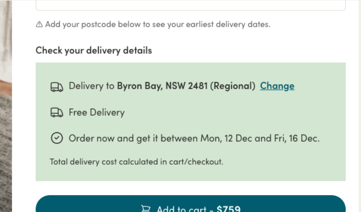
How Koala’s delivery tracker widget looked like before checkout
The problem was, Koala’s delivery checker was solving a problem for the business. Customers had logistics-related questions, and having delivery details shown upfront saved Koala’s customer service team time handling these inquiries.
Consulting Contentsquare, Scott and his team found people spent an average of 43 seconds on Koala’s website across all page groups — not enough time to sell a visitor on a high-end furniture product emotionally. Having more information could hamper the decision-making process.
The Koala product team A/B tested moving the delivery checker widget later in the funnel, and found that this improved add-to-cart, conversion rates, and checkout stats:
Information overload is real, and removing distractions for your visitors can give them a better experience.
2. Test your assumptions
Conventional e-commerce wisdom says cross-selling helps to increase your average order value (AOV).
It’s worked for businesses like Costco and B&Q.
But unlike Costco, Koala’s luxury furniture wasn’t the type (most) people bought on a whim. An average basket size of $1000 meant slower purchase decisions over a few days.
If you’re spending a thousand dollars, a few hundred more on a recommended item isn’t chump change. Therefore, was a cross-sell widget a good fit for Koala’s UX and selection of high-end products?
The team used A/B testing and Contentsquare’s Zoning Analysis’s click metrics to validate their assumptions. In the Japan market, they focused on only cross-selling super-relevant and discounted products, improving year-on-year cross-sell rates by 16-20%

Once again, applying the less is more principle helped Koala improve add-to-cart rates and order completions, bringing in over AUD 350k incremental revenue per quarter.
3. You can’t learn if you don’t fail
When to comes to experimentation, it’s better to fail a few times than to always succeed. To walk the talk, Scott’s team removed a feature that they thought would be helpful but wasn’t.
At Koala, visitors usually have a multi-session purchase journey. After seeing a product on the Koala website for the first time, they’ll take a few days to research product reviews and competing products.
Consulting Contentsquare, Scott and his team saw apparent differences in how people browsed the website depending on where they were on their decision journey.

The team hypothesized shorter buying processes would help conversions. They developed a ‘favorites’ feature for customers to save products they were interested in, making it easier for customers to continue the buying journey.
But after deployment, they realised that people weren’t using the feature as much as they thought. There was in fact, minimal impact on add-to-cart, order completion, or revenue metrics, which led the team to removing the feature.
The learning? Even though you thought something was going to be useful for users, always listen to the data and always put your users first.
3 user experience tips from Scott on designing for simplicity in a chaotic digital world
- More information doesn’t always work for people with short attention spans: Too much information at the wrong stage of the customer journey can be detrimental to UX and business metrics. Ask yourself if the information is necessary, and always A/B test to validate your assumptions.
- Review and test your assumptions at least once a month. Questioning if conventional e-commerce best practices applied to Koala uncovered hidden opportunities for improvement.
- Embrace failure and be ready to kill your darlings: Sometimes things just don’t work as expected, and that’s okay! Either iterate or prepare to kill the feature if people don’t find it helpful or if there’s no significant impact on your usage metrics.
If you couldn’t attend CX Circle Sydney, don’t worry because we’ve got you covered. You can catch all sessions on demand here.